Dubai SALIK Tag Design Contest: How I Designed Using Only 4 Colors
SALIK Tag Design Contest taught me something weird: When the artwork is small, your concept has to be loud. Not detailed. Not complicated. Loud. Because people don’t “view” a tag. They glance at it. At speed. In real life lighting. So I built a concept called Panda in Dubai.
Jan 31, 2026
Design
2 min

But first, the constraint that forced everything.
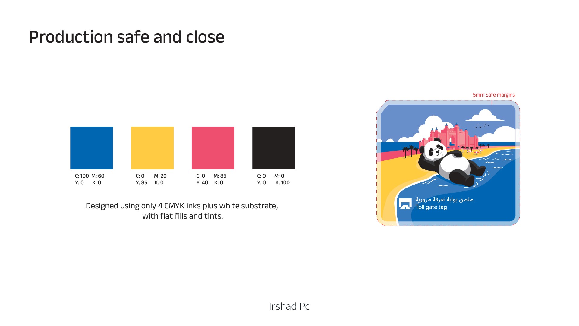
SALIK had a rule: max 4 colors.
Black counts as one color.
White can be the paper color.
That single rule killed 90% of fancy ideas instantly.
And it gave me the direction.
Here’s exactly what I did
First: I didn’t start by drawing landmarks.
I started by asking:
“What concept still reads when I remove detail?”
Then I picked a character that survives small size.
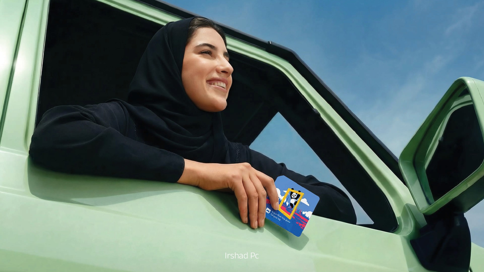
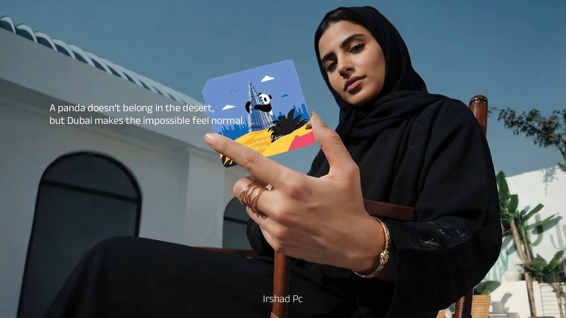
A panda.

But why a panda?
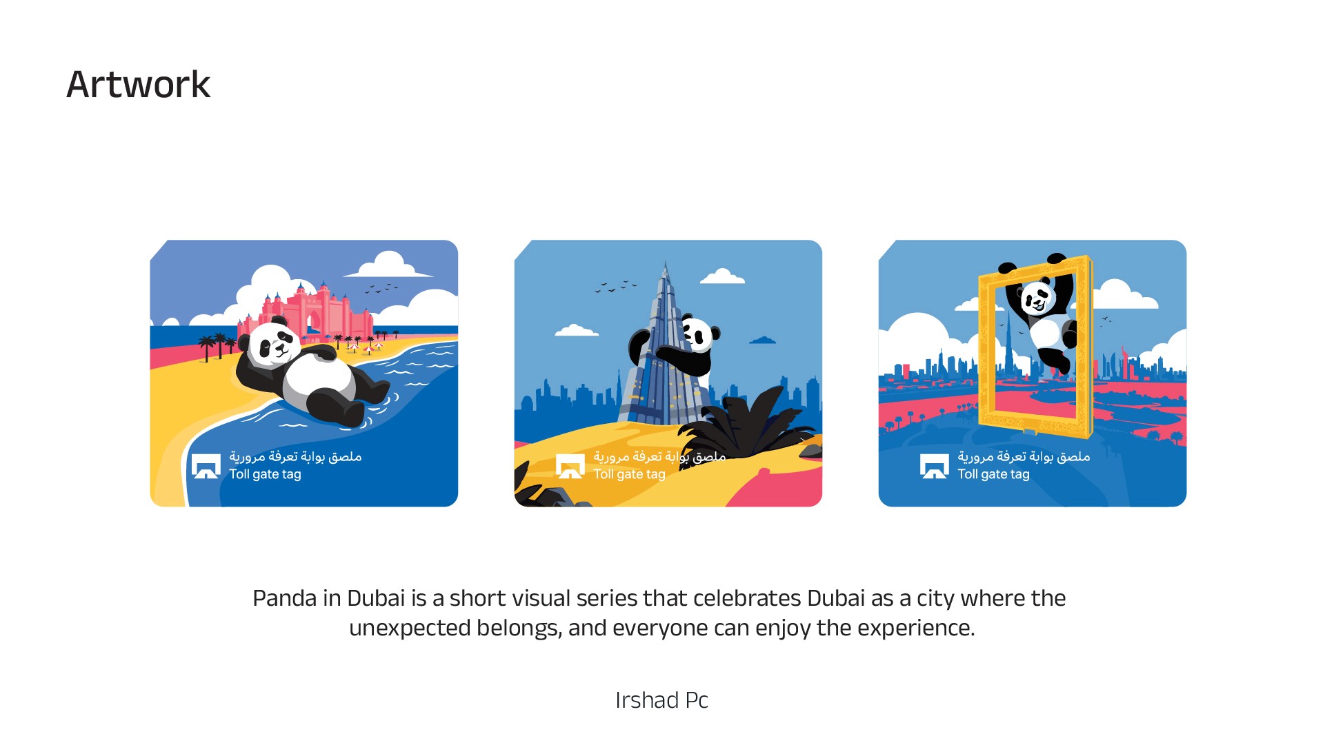
Because Panda in Dubai is a short visual series idea.
It celebrates Dubai as a city where the unexpected belongs, and everyone can enjoy the experience.
A panda doesn’t belong in the desert.
But Dubai makes the impossible feel normal.
That’s the whole story in one line.
And it works perfectly for a tag because it’s instantly readable.
Then I did the opposite of what most people do
Most entries try to show “Dubai is modern” with skyline and realism.
I went for “Dubai is welcoming” with character moments.
Panda hugging Burj Khalifa.
Panda playing around Dubai Frame.
Panda enjoying the city like it’s his playground.
Simple shapes. Big contrast. Clear silhouette.
Because if the silhouette works, the tag works.
But the next part is what made it click
That 4-color rule didn’t just limit the palette.
It forced better design decisions:
No tiny textures that disappear in print.
No gradients that break.
No over-detail that turns into noise.
Just clean shapes and bold storytelling.
Most people treat contest work like a one-off
I didn’t win.
But I’m still happy because it proved something valuable:
A contest entry can be a prototype for a reusable character system.
This panda concept is not just for a tag.
It can become:
App mascot style like Duolingo
BTS reels character like Tiny Chef
A consistent visual identity I can reuse across products and content
The real takeaway
Small canvas design is not about squeezing more in.
It’s about choosing one idea that survives constraints.
The 4-color rule didn’t reduce creativity.
It removed distraction.